Consent Without Conflict: Designing Privacy Prompts That Respect the Buyer
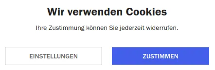
Photo: chris 論 (for the screenshot), Public domain, via Wikimedia Commons
Privacy banners were supposed to clarify. In too many online stores and lead-generation sites, they have become another obstacle between a customer and the task they came to complete. A visitor lands on a product page, a checkout, or a consultation form and is met with a stack of toggles, a wall of legal language, and a “reject” link that is deliberately hard to find. The result is not trust. It is fatigue.
As of 2026, US businesses are working within a patchwork of state privacy laws, sector-specific rules, and platform requirements. The details vary by state and by business model, and this article is not legal advice. But the design problem is consistent: consent interfaces often punish the customer for a company’s internal uncertainty. Treating privacy UX as a conversion and trust issue — not just a legal checkbox — produces better outcomes for both sides.
The Cost of a Defensive Banner
A defensive banner assumes the visitor is an adversary. It interrupts the page, dims the content, and offers a bright “Accept all” button beside a muted “Manage preferences” link. It may reappear on every visit or follow the customer from page to page. On mobile, it can cover the checkout button entirely.
Those choices have a measurable cost. Customers abandon forms, delay purchases, or leave for a competitor with a less hostile experience. The business may believe it is collecting stronger consent, but it is often collecting resentment. A banner that is technically present but practically coercive is not a good foundation for trust.
Start With Data Minimization
The simplest way to reduce consent friction is to collect less. Before redesigning a banner, inventory the scripts and tags that run on the site. Analytics platforms, advertising pixels, session-replay tools, chat widgets, and lead-scoring services all have different purposes and different data needs. Some may be unnecessary. Some may duplicate others. Some may have been installed for a campaign that ended years ago.
Removing nonessential tracking reduces the number of consent categories a visitor must understand. It also reduces legal exposure and page weight. Data minimization is not only a compliance principle; it is a usability strategy. Every script removed is one less thing to explain, one less thing to break, and one less reason to interrupt the customer.
Banner Basics That Reduce Friction
A consent banner should be short, clear, and balanced. The first layer should explain in plain language what the site uses data for and offer an equally prominent way to accept or reject optional categories. “Accept all” and “Reject optional” should be visually comparable. A link to a detailed preference center should be easy to find, not hidden in fine print.
The banner should not block content unnecessarily. If the site can function without optional cookies, it should not hold the page hostage. It should remember the visitor’s choice and avoid repeated prompts unless something material changes. On mobile, buttons should be large enough to tap, text should remain readable without zooming, and the banner should not obscure the primary action.
The Preference Center Should Be Usable
A preference center is not a legal document with toggles. It is a control panel. Categories should be named in human terms — “Analytics,” “Advertising,” “Functional” — with a short explanation of what each one does. Optional categories should be off by default unless the business has a valid basis for another approach. A save button should confirm the choice, and withdrawing consent should be as easy as giving it.
Dark patterns undermine the entire exercise. Pre-checked boxes, tiny reject links, confusing double negatives, and “are you sure?” loops may increase acceptance rates in the short term, but they erode trust. Customers notice when a site makes privacy choices difficult, and they carry that impression into the purchase decision.
Forms and Lead Capture
Lead forms deserve the same scrutiny. Ask only for the information the business will actually use. Explain why each sensitive field is needed. Separate marketing consent from service communication so a customer can request a callback without being added to a newsletter. Use unchecked opt-in boxes and place the privacy notice near the submit button, not in a distant footer.
For service businesses, a short note such as “We use this information to respond to your request” is more useful than a paragraph of generic legalese. Clarity reduces abandonment and gives the customer a reason to trust what happens next.
Analytics and Third-Party Tags
Consent choices must actually control the tags. A common failure is a banner that records a preference while nonessential scripts fire before the choice is made or ignore it entirely. Test the site with optional categories rejected and confirm that advertising and analytics tags do not load. Review vendor documentation, use consent-management features where appropriate, and document the behavior so it can be retested after site changes.
An Audit Checklist
A practical review can be completed in a few passes:
- Inventory every script, tag, and form on the site, including those added by plugins or embedded widgets.
- Test the banner on desktop and mobile, including the reject path and the preference center.
- Confirm that accept and reject options are equally prominent and that optional categories are off by default.
- Check that the banner does not block checkout, forms, or core content longer than necessary.
- Review lead forms for unnecessary fields and bundled consent.
- Verify that rejected categories do not fire and that choices persist across pages.
- Confirm that privacy notices are linked near the point of collection, not only in the footer.
- Test keyboard navigation, screen-reader labels, and color contrast.
- Document decisions and schedule a review when laws, vendors, or site features change.
Compliance and conversion are not natural enemies. A customer who understands what a site is asking — and can say no without a fight — is more likely to stay, complete a purchase, and return. The businesses that treat privacy UX as part of the front door, rather than a legal barricade, will earn both consent and confidence.